ok, I'll encourage you by asking you to think harder about the choices you make in design.
Here's my analysis of what I see going on above:
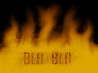
First we have your design:

- sample1.jpg (36.56 KiB) Viewed 8311 times
Here we have your design blocked in:

- sample2.jpg (10.35 KiB) Viewed 8310 times
Sort of looks like a barn or a tent? Are those shapes exciting now?
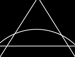
This illustration shows how your design is looking when ratio related proportions are superimposed:

- sample3.jpg (44.31 KiB) Viewed 8311 times
*Note that by blocking in with this measure you have 3 horizontal points of focus. [way too many!]
The lowest point of focus - the closest to your eye, where your text/sig is, is out of alignment and set in the most equalizing hue on your color palete.
The closest focal point to your eye should be the darkest colors, the furthest away from your eye should be the lightest colors. You have effectively reversed that by not making your text/sig have more black in it's tones and shadows.
This illustration shows how your design is looking in a 1-point perspective layout:

- sample4.jpg (28.39 KiB) Viewed 8310 times
*Note now with this measure superimposed those 3 horizontal points of focus are more plainly visible, thus you have: 1. effectively cut the rectangle in half. 2. not carried the 1-point vanishing point off the page or to the very top. 3. created tension by not having equal left and right margins that make your eye shift OFF or AWAY from that object because it's uncomfortable. Unfortantely, that's the exact location of the frame that you want to ATTRACT the eye.
This illustration shows a more formal rectangular measure, I based it on your original design:
- sample5.jpg (12.5 KiB) Viewed 8308 times
There are many ways to now play with proportion, measure, tone, scale easily if you can see it in it's most simplistic form.
One way to create tension is to NOT have: everything equal, everything going in the same direction, and everything the same tonal range...the higher the contrasts between all or any of these things is what makes for a more meaningful message and more exciting eye candy experience.
Here I've taken the new proportions and will suggest only 1 of a million or more ways to make it more exciting:

- sample6.jpg (40.93 KiB) Viewed 8309 times
Think about it!
Doc